I signed into my blog today for the first time in more than two years! I had no idea just how long ago it had really been - just that it had been quite a while.
I was thinking maybe I would maybe write a post, but instead I have decided to end it - the blog, that is.
When I first started posting, I was starry-eyed, a brand new Etsy shop owner at DreamON. I discovered someone in the Forums on Etsy who was doing a 90 posts in 90 days challenge. This challenge was to promote shops within the group, and decided I it would be fun to discover other Etsy shops, beneficial to learn how to do a blog, and also to use the blog to promote my own shop. I learned so much in that first year of my Etsy shop, 2007. It was very exciting to be doing all of this online stuff. Learning how to do this blog was the biggest benefit of this 90-day challenge, I think.
I enjoyed that challenge, and I did learn a lot. I have no idea if my posts on this blog helped the others. It really didn't help my shop. What it did was to completely take the focus off the reason I started the blog in the first place, which was to promote my own shop and increase visability.
When the 90 days were over, I started finding out what it was to post to a blog - a grind. I was a pretty regular poster for a long time. Then one day, I looked around and realized that there were virtually no comments being made. I thought, "Why am I doing this if nobody sees it?" I started to be less regular, and less regular, and finally it tailed off to where I couldn't think of anything to say, and I forgot about it.
Since that time, I have done a Facebook page, joined Pinterest and Zazzle, done some work with Craftori until it turned into Craft Noodle. ? (Why, I wonder, that name? ) and plodded along with my Etsy shop.
I guess, although I have learned a lot, that there is so very much still to learn, but I am ending this chapter of the book, counting it as just another lesson learned.
Today, I am ending the blog. It's done.
Here is where I have an online presence: DreamON on Etsy, MHamiltonArt on Zazzle, on Pinterest at Mary Hamilton and on Facebook at MaryHamiltonArt (when you're signed in). Please visit me there for new developments in the world of my art. Thank you!
Thursday, February 11, 2016
Monday, June 9, 2014
When Art Can Be A Gift
Art is not something ordinarily something you think of when wracking your brain for gift ideas, but why not give the gift of art?
People without a lot of art knowledge sometimes fear buying art even for themselves. I wish this didn't happen. If you hear a new song that you like, you want to hear that song. If you like bananas or salmon, you choose to eat those foods. If you like only blue shirts, you wear blue shirts. I'm just saying what kind of art you like should be as natural as these other kinds of choices. Choice really is a natural thing. You either like something when you make a decision, or you are neutral, or you really don't like the thing. You should never buy a piece of art for yourself if you don't like it! If your boss's wife loves it, be unselfish and let her buy it.
Buying art isn't as permanent as a tattoo, and people don't seem to avoid body art. So, be bold, treat yourself! Buy yourself a piece of art! How many times have you ever been sorry you bought yourself something you really like? Not ever. Really. (Unless, of course, you have a spending problem!)
It follows that your friends and relatives also have definite personal likes and dislikes. One likes cats, and the other dogs. One likes classical music, the other reggae. So you need to consider what they already have chosen to have around them. What colors do they have in their surroundings? Neutral colors, pastel colors or bright colors? You probably even know their favorite color. Do they like antiques or modern furnishings? Curves and frills or clean lines?
When to buy art? Give the gift of art when you know it would look fantastic with your friend's decor. It doesn't have to be large or costly. If you have a special relationship with a person, the fact that you bought it for them makes it special. Give them art as a housewarming gift, a wedding gift, or a Mother or Father's Day gift, or just because. There doesn't have to be a reason! Purchase when you know you've found just what that special friend has been looking for! At least take a quick photo, and text or email it if you just want to share where it can be found. If this person is someone you shop with a lot, you know you have a good idea what they like, and you could just buy them a little spur of the moment art gift.
Another time to buy the gift of art is for someone elderly or ill who needs cheering up. Send them a get well or cope card, and enclose a small watercolor ACEO! It may be just the lift they need to make their day!
If you are traveling and know your friend has a special memory of where you currently are, send or bring them a little art gift.
How many times have you ever been sorry you bought yourself something you really like? Not ever. Really, unless you have a spending problem!
Remember, if you wait, you may never find that piece of art again. Even if you think you will remember, somehow you don't - or worse, it's gone!
You can find or inquire about any of these paintings at my online shop, DreamON.Etsy.com .
People without a lot of art knowledge sometimes fear buying art even for themselves. I wish this didn't happen. If you hear a new song that you like, you want to hear that song. If you like bananas or salmon, you choose to eat those foods. If you like only blue shirts, you wear blue shirts. I'm just saying what kind of art you like should be as natural as these other kinds of choices. Choice really is a natural thing. You either like something when you make a decision, or you are neutral, or you really don't like the thing. You should never buy a piece of art for yourself if you don't like it! If your boss's wife loves it, be unselfish and let her buy it.
;return true;\"></FORM>") |
| Years of Growth |
 |
| Magnolia Time |
It follows that your friends and relatives also have definite personal likes and dislikes. One likes cats, and the other dogs. One likes classical music, the other reggae. So you need to consider what they already have chosen to have around them. What colors do they have in their surroundings? Neutral colors, pastel colors or bright colors? You probably even know their favorite color. Do they like antiques or modern furnishings? Curves and frills or clean lines?
When to buy art? Give the gift of art when you know it would look fantastic with your friend's decor. It doesn't have to be large or costly. If you have a special relationship with a person, the fact that you bought it for them makes it special. Give them art as a housewarming gift, a wedding gift, or a Mother or Father's Day gift, or just because. There doesn't have to be a reason! Purchase when you know you've found just what that special friend has been looking for! At least take a quick photo, and text or email it if you just want to share where it can be found. If this person is someone you shop with a lot, you know you have a good idea what they like, and you could just buy them a little spur of the moment art gift.
Another time to buy the gift of art is for someone elderly or ill who needs cheering up. Send them a get well or cope card, and enclose a small watercolor ACEO! It may be just the lift they need to make their day!
 |
| Leaves On The Move |
If you are traveling and know your friend has a special memory of where you currently are, send or bring them a little art gift.
 |
| Castle Builder |
How many times have you ever been sorry you bought yourself something you really like? Not ever. Really, unless you have a spending problem!
Remember, if you wait, you may never find that piece of art again. Even if you think you will remember, somehow you don't - or worse, it's gone!
You can find or inquire about any of these paintings at my online shop, DreamON.Etsy.com .
Monday, May 26, 2014
Pretty Party Tempered Glass Cutting Board
As a test, I ordered a tempered glass cutting board when it was on sale on Zazzle to see how the design would look in person. It came from my large watercolor collage called "Chaos." This product was thrilling to see! It is so pretty. The little bits of confetti cuttings from an old watercolor painting that made up the collage look like little jewels through the glass. The rust and cobalt blue design looks gorgeous against the backdrop of cream from the underside of the cutting board. It looks so festive, and it just looks like a party is happening. So I changed its name to "It's A Party." Click on the link below to see.
Abstract Art Rust and Blue Glass Cutting Board is available in my Zazzle store now.
This cutting board would make a great wedding gift or housewarming gift. I am going to keep this one, and I look forward to using it at our next festive gathering.
The following is a link to my store on Zazzle. I am still learning how to use Zazzle, so I it's a bit of a work in progress.
http://www.zazzle.com/mhamiltonart*
Thank you for looking!
 |
| It's A Party |
Abstract Art Rust and Blue Glass Cutting Board is available in my Zazzle store now.
This cutting board would make a great wedding gift or housewarming gift. I am going to keep this one, and I look forward to using it at our next festive gathering.
The following is a link to my store on Zazzle. I am still learning how to use Zazzle, so I it's a bit of a work in progress.
http://www.zazzle.com/mhamiltonart*
Thank you for looking!
Tuesday, May 13, 2014
Have You Ever Wondered What ACEO means?
In this day new abbreviations are popping up like weeds. They are used for lots of things that, unless you're in the know, you don't know what in the world it means. There are remedies for medical conditions with abbreviations used in television advertisements like COPD or ED. I found they abbreviate cat breeds like DLH or DSH in the kitty's vet records. Abbreviations are commonly used for organizations, because without shortening, I guess the names are just way too long to fit in a blank space on some form or another. These are things like CIA, FBI, ALPA or YMCA. You get the idea. Anything can abbreviated to express, I guess, someone's displeasure with saying or writing the whole thing out.
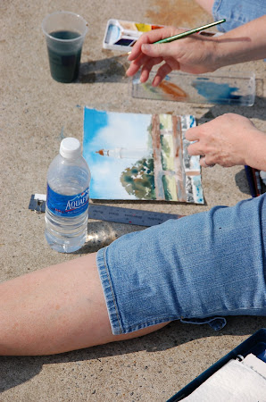
ACEO is one of these abbreviation "thingys" that has come to mean art of a certain size. To be an ACEO, the art must be exactly 2 1/2 inches x 3 1/2 inches (64 mm × 89 mm). ACEO stands for Artist Cards, Editions and Originals. It's known by the acronym, ACEO. Artists began with trading small samples of their work with one another, often through the mail. Then they were known as ATC (or Artist Trading Card), and they still are. There was no money exchanged; they were simply traded between artists. Then, somewhere along the way, they became popular with people who did not make art, and a price began to be charged when there was nothing with which a non-artist could reciprocate the trade, other than money. Because they were no longer just traded, another abbreviation was born to express the amount an artist would charge for an artist card - ACEO. ACEOs began to appear in online auctions such as eBay. The more an artist is collected, the higher the value of the card goes.
An ACEO can be created of almost any medium an artist can produce in this size. They are the same size as baseball cards, and they can be collected in the standard size sleeves or sheets available at art or office supply stores (and other locations). They can be matted, framed and hung as a single piece or in a collage arrangement with similar sized miniature works of art. They can be used for scrapbooking. They can also be used as a refrigerator decoration. I'm sure there are other uses also.
What, you might ask is an Edition? This refers to a reproduction or print of an original artist card. If the Edition is a Limited Edition, it is numbered by the artist to express how many likenesses are going to be created of a certain piece of work. You then would see something that looks like this (75/500) on the card which means that card is number 75 in an edition of 500. If, however there is no number, it generally means it is an Open Edition. Open Edition means that the artist could make an unlimited number of copies (reproductions or prints) as in thousands, millions, etc.
To be an Original is much more valuable because it is "the one" that the artist created for the first time with his or her own hands. It is an original, but not necessarily one of a kind (OOAK). If the description reads "Original OOAK" or "OOAK", it means that the artist is saying that this creation is the only one of its kind that will ever be created, or that is permitted to be duplicated by law.
I have scattered some of my original ACEOs throughout this article. All of them are currently available in my Etsy store DreamON .
I hope this helps define what an ACEO is for those who might still be wondering. Enjoy!
 |
| Poppy Letter |
ACEO is one of these abbreviation "thingys" that has come to mean art of a certain size. To be an ACEO, the art must be exactly 2 1/2 inches x 3 1/2 inches (64 mm × 89 mm). ACEO stands for Artist Cards, Editions and Originals. It's known by the acronym, ACEO. Artists began with trading small samples of their work with one another, often through the mail. Then they were known as ATC (or Artist Trading Card), and they still are. There was no money exchanged; they were simply traded between artists. Then, somewhere along the way, they became popular with people who did not make art, and a price began to be charged when there was nothing with which a non-artist could reciprocate the trade, other than money. Because they were no longer just traded, another abbreviation was born to express the amount an artist would charge for an artist card - ACEO. ACEOs began to appear in online auctions such as eBay. The more an artist is collected, the higher the value of the card goes.
 |
| Leaves On The Move |
 |
| Cheerleader |
To be an Original is much more valuable because it is "the one" that the artist created for the first time with his or her own hands. It is an original, but not necessarily one of a kind (OOAK). If the description reads "Original OOAK" or "OOAK", it means that the artist is saying that this creation is the only one of its kind that will ever be created, or that is permitted to be duplicated by law.
 |
| Sunrise |
I have scattered some of my original ACEOs throughout this article. All of them are currently available in my Etsy store DreamON .
I hope this helps define what an ACEO is for those who might still be wondering. Enjoy!
Saturday, October 26, 2013
Things I Love - No. 8 - Home
Today and all this week, I have just loved being back home in Florida again!


Saturday, October 12, 2013
Things I Love - No. 7 - I Love Colorado
I had been enjoying writing these posts daily and things were moving right along. Now I realize this is a process that will unfold at its own pace. It has been a busy, busy month, and there were times this past month of joy as well as sadness for my home state. See map found in The Denver Post on September 19 2013.
Denver Post Map of 2013 Flooding
Denver Post Map of 2013 Flooding
A month ago the massive flooding began to occur in Colorado, and I could not help being mesmerized by the 24/7 reporting on Denver TV stations. It was horrific to watch the flooding unfold then, and now the cleanup goes on and on and on. This disaster will total billions of dollars. It will take years, just to replace roads. What about communities? What about lives uprooted? What about the people?
I Love Colorado!
Thankfully we personally weren't in the path of this disaster which has been described as a thousand-year flood. Still, lives were lost, and many people have lost their homes. As of today, new communities are finding e-coli in their water supply, and this is a month later. People have had to wear gloves to clear out personal belongings they had accumulated from their homes, because the flood waters that filled their homes were so toxic.
I couldn't be unaffected, because I was raised on the Front Range and lived all around the Denver area for many years. These photos on TV were of places that were familiar to me, and there are many memories of having walked over the bridges over Boulder Creek where the water was up to the top, of picnics and gatherings along the banks of the Big Thompson River, and of driving countless times through the towns of Longmont and Loveland on Hwy. 287 from Lakewood to Fort Collins. Both of these towns were cut in half. Simply to see familiar buildings and terrain destroyed is shocking. I can't imagine the terror some of the residents of the canyons felt, and the physical injuries that occurred while tons of rushing water and continuous rains prevented rescue.
It will take years for the state to recover, and it's not only the floods, but also the terrible fires that have affected parts of Colorado in the last two years. Thousands and thousands of acres have burned, and many homes have been destroyed and more lives.
I know that in time recovery will happen. I also know that the scars will be here for a long, long time. Forests take a lifetime to re-grow, and a whole lot of people don't have enough years left on earth to see that happen. That makes me sad for Colorado.
All of this has reinforced how much I love the state I grew up in. I love Colorado!
Wednesday, September 11, 2013
Things I Love - No. 6 - Creativity!
Everything that exists, exists because of creativity! It isn't just inventors or scientists, artists or composers or singers. We all have the creative spark, maybe not in all areas, but every single person has it. Creativity is special and wonderful, and admirable.
Whoever came up with the painted rock or the jellybean or the cell phone, microwave or wireless outdoor speakers? How did the tooth fairy ever exist without tooth fairy pillows to slip the payment into? How did the flameless candle come about? Who invented upcycling? There are just so many wonderful creative things that have been turned into a new thing with an entirely new life and usefulness to a new generation of people.
A couple of interesting and creative finds:
A Means of Saving Too Short Skirts
Replacement For The Boring Light Switch Cover
I love creativity!
Sunday, September 8, 2013
Things I Love - No. 5 - Fall Foliage
I do love Fall. It is my favorite season, but that said, I hate to let go of summer. When I start seeing the first trees start to turn, I think about the cold and snow to come . . . I have to admit these are mostly feelings from all the years I lived in Colorado. I'm not even planning to be here for the winter. I plan to be in Florida, way before winter. So what's up with that? I just remember how LONG winter lasts, driving on snow and ice, freezing!
However, that said, I would really miss Fall, if I weren't here to see the extremely gorgeous golden hillsides, and sparks of gold among the green on other mountains. Fall is usually the best weather of the year in Colorado, and the sky is so intensely blue that it doesn't seem real. And best of all, it's just beginning. In two weeks or so, it will be at its peak, and that is so amazing!
This is a photograph of what we have today. It's still summer, the sky isn't that incredible blue just yet, but doesn't it look like a painting just waiting to happen?
 |
| The beginning of the season change |
Saturday, September 7, 2013
Things I Love - No. 4 - Having Lunch With An Old Friend
Today I had the pleasure of having lunch with an old friend. It was a long, long lunch where it seemed like no time at all had passed since we last had coffee, or for that matter were in school together and shared many good times with the same friends. It speaks to the value of the Greek system and how valuable a lifelong friendship with sisters can be. This piece of clip art I found struck me as capturing the spirit of our afternoon together, catching up and sharing a little bit of the old and a little bit of the new.

Credit to http://bestclipartblog.com
Credit to http://bestclipartblog.com
Friday, September 6, 2013
Things I Love - No. 3 Sunrise and Sunset
My most favorite times of the day are sunrise and sunset. I grouped them together, because one completes the other. As an artist, painting a sunrise or sunset challenges me, but nothing is like the real thing. I have paint, which goes a long way to putting an image on canvas or paper, even without brushes. How the airy canvas of the sky turns colors is nothing but a miracle, every day! Here are some of my favorites.
 |
| Stormy evening on the Sunshine Skyway Bridge |
 |
| Beautiful long-lasting sunset from Panama City Beach |
 |
| Lovely morning clouds in Colorado |
 |
| Winter sunrise at Madeira Beach, Florida |
Wednesday, September 4, 2013
Things I Love - No. 2
Today, I am sharing my love of flowers. I love to paint them, but I also love to take photos of them. Flowers seem like such an awesome extravagance of creation, something that is there simply as a gift of beauty for anyone who takes the time to just drink it in.
Monday as we drove into Breckenridge, Colorado, to go to the Art Festival there, suddenly we happened on an incredible field of poppies of many colors with some other flowers mixed in. They hadn't been there too long, and had apparently been planted by a developer to attract people in to look at property. What a brilliant idea, and such a treat for us as we had to stop and take some pictures to help keep the memory fresh. It was an amazing sight and a great present for Labor Day!
Monday as we drove into Breckenridge, Colorado, to go to the Art Festival there, suddenly we happened on an incredible field of poppies of many colors with some other flowers mixed in. They hadn't been there too long, and had apparently been planted by a developer to attract people in to look at property. What a brilliant idea, and such a treat for us as we had to stop and take some pictures to help keep the memory fresh. It was an amazing sight and a great present for Labor Day!
 |
| Beautiful Field of Flowers |
Tuesday, September 3, 2013
Things I Love No. 1
Things I Love. There is no order to the these loved things I am going to put on the blog. It's not like I am going to start at 99 and work backwards, or that I am going to start with my top loved thing. I expect to learn some things about myself as I progress.
As I begin this project, what popped into my mind this morning was kittens! I do love kittens! Here is one I painted a few years ago.

And I just saw such a funny video of cats and dogs on Facebook that made me giggle and wonder, "Why do they do this?"
Here is the link:
Cats and Dogs In Boxes
Yes, for sure I love kitties! Puppies will get their day too, I think.
Thursday, March 7, 2013
Proud Grandma
I am so proud of my granddaughter, Katelyn, whose artwork is currently in an exhibit at the Worcester Art Museum. She was one of five in her school to be selected, and that is really good news, since she loves to draw more than anything -- and her grandmother thinks she's pretty darn good. I have never seen her use collage as a medium before, so kudos to her and to her art teacher! Katelyn is just in third grade. This is her ballerina collage.


Sunday, March 3, 2013

Monday, February 18, 2013
Colors and Clutter In My Life
Exciting news around here is that we finally have color in our home's interior! Years ago before we moved in here, we were going to have the place painted first, but we completely stalled on color choices. We have had beige walls and beige carpet throughout the place, and after awhile you just forget about them. We put in these horrendous gaudy orange window coverings and matching throw pillows, and absolutely hated them until one day, we just could stand them no more and ripped them down and threw them out. Then all that was left was beige!
It is somewhat ironic and humorous to me, as an artist, that I couldn't decide with a blank slate what colors I wanted to live with on a daily basis. "If you don't like it, paint it," has always been by retort to watching shows with prospective home buyers who hate the colors. This is because we have always done our own painting up until this time. It's much more difficult when you have 9 ft. ceilings.
It wasn't any easier this time. I fought for color, but the designer finally won out, and the main area is all taupe, and it does look nice and will be a nice background for varied artwork. But! My studio is a lovely and bright shade of apple green, and I love how fresh it looks already. The master bedroom is a grayed-down shade of Tango Tangerine, and since it is a northeast exposure, the paint has just added so much brightness and life to it. The guest bedroom and bath is a lavender gray, and looks wonderful.
My one source of bafflement now is how to get my shelves back up. Just before the painting was done, my top shelf gave out and came crashing to the floor. It was a tremendous, reverberating crash! Seriously, if I had been sitting where I paint, I would be pushing up daisies instead of writing in my blog. Now I need to find some way to install them securely and safely, because I am totally spooked at the idea of having anything behind or beside me that could come crashing down without warning.
Anyway, love the colors! Love the painters who were so adept and fast at their work. I am really impressed. Pictures will follow when my studio looks like more than a junk pile with pretty walls.
Subscribe to:
Posts (Atom)
My Workspace
On The Pier At St. Simons Island